BAUFARM · Brand identity and packaging collection
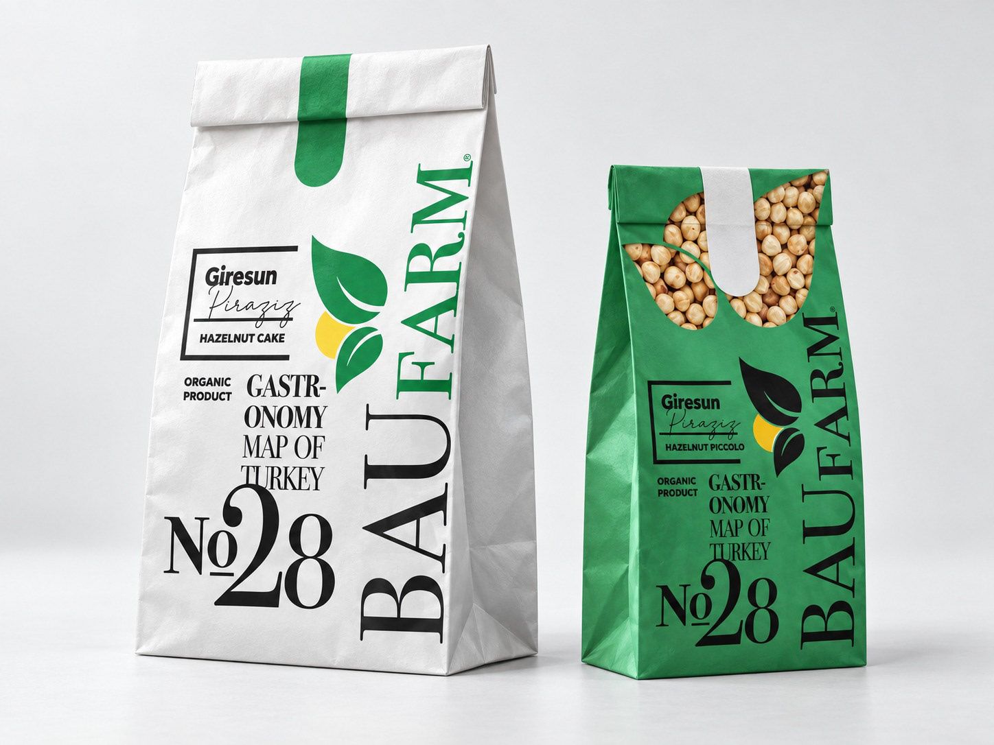
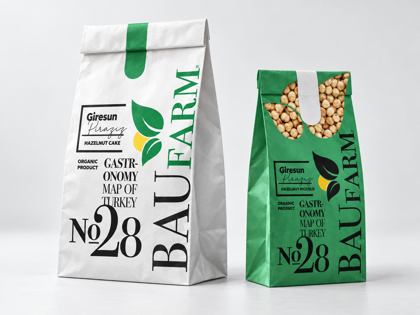
BAUFARM · Hazelnut packaging
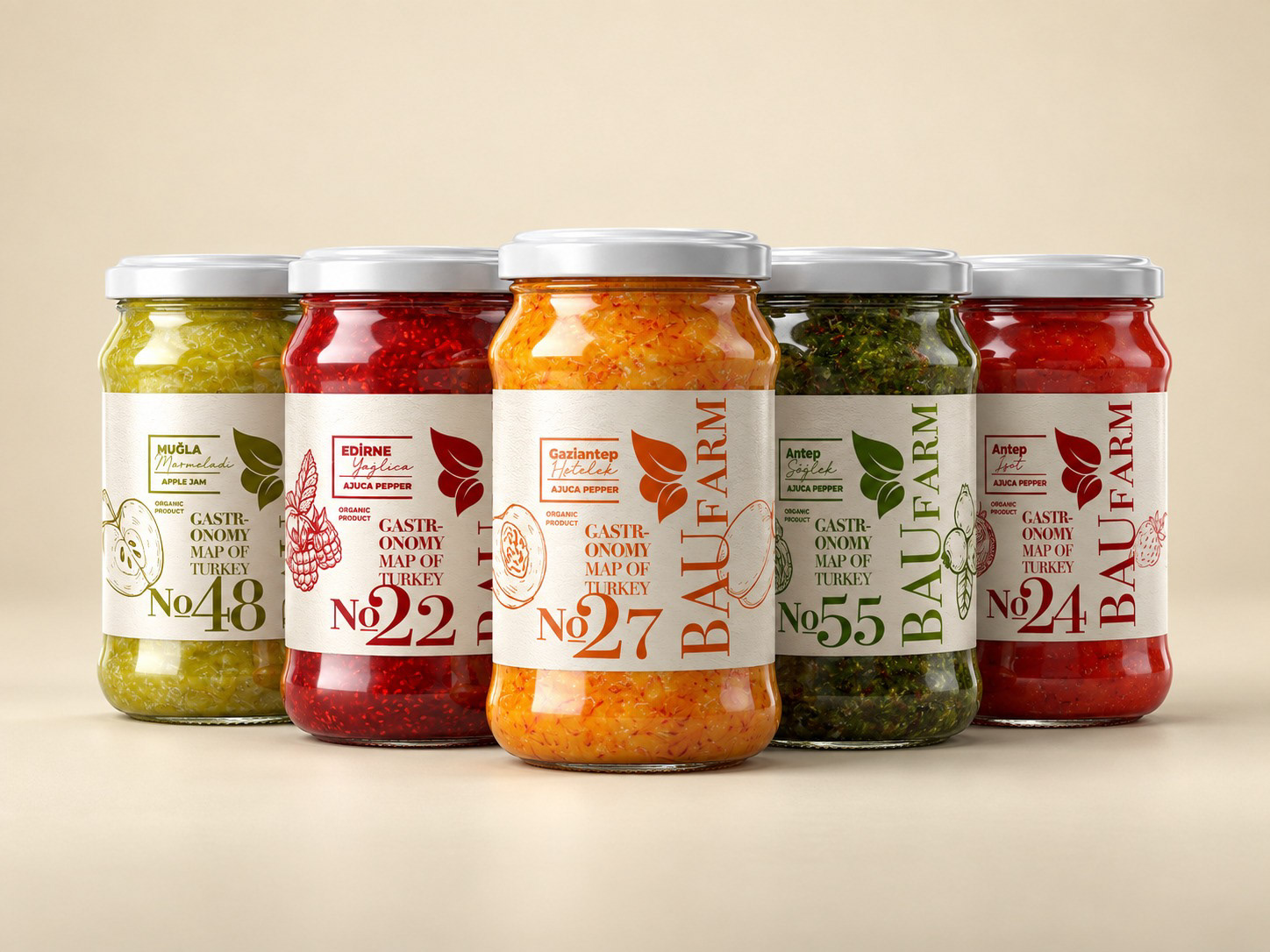
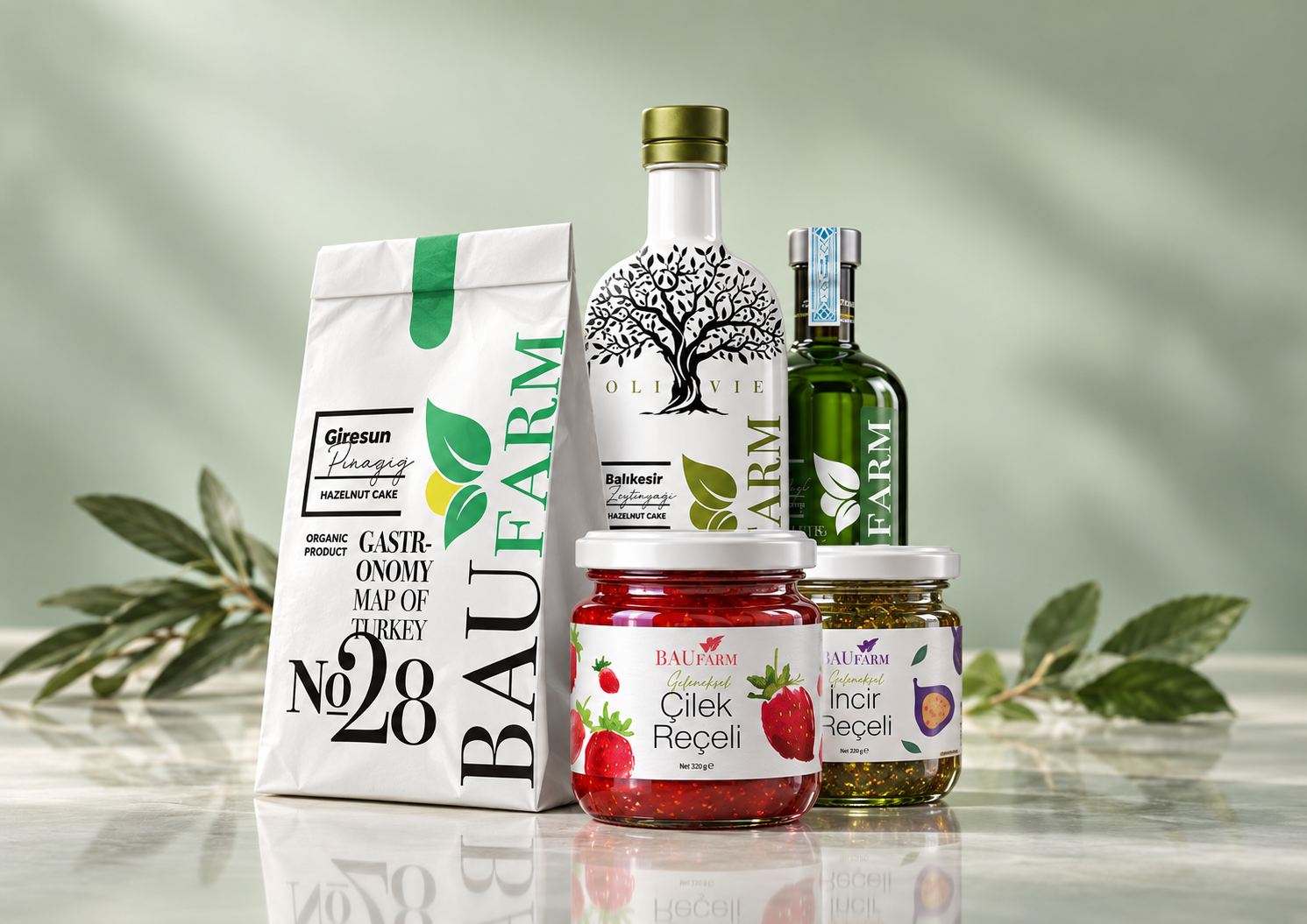
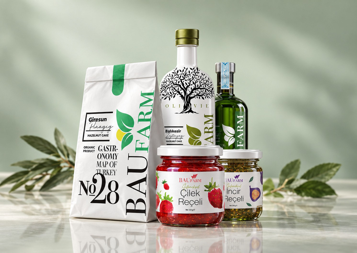
BAUFARM · Regional food collection
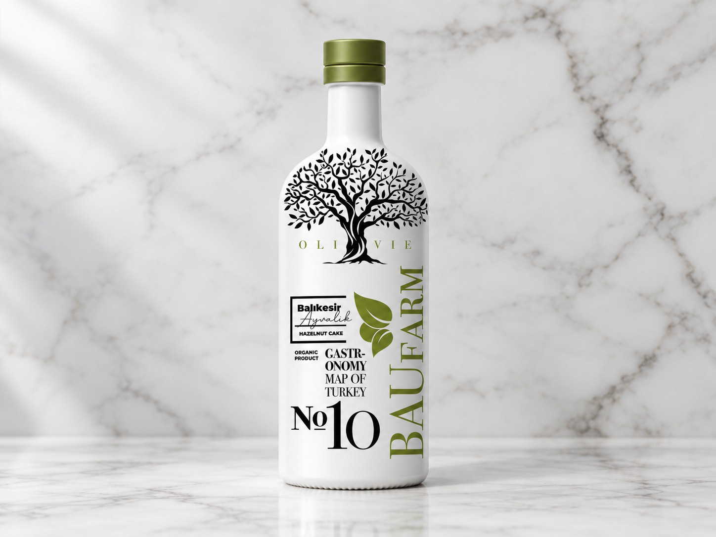
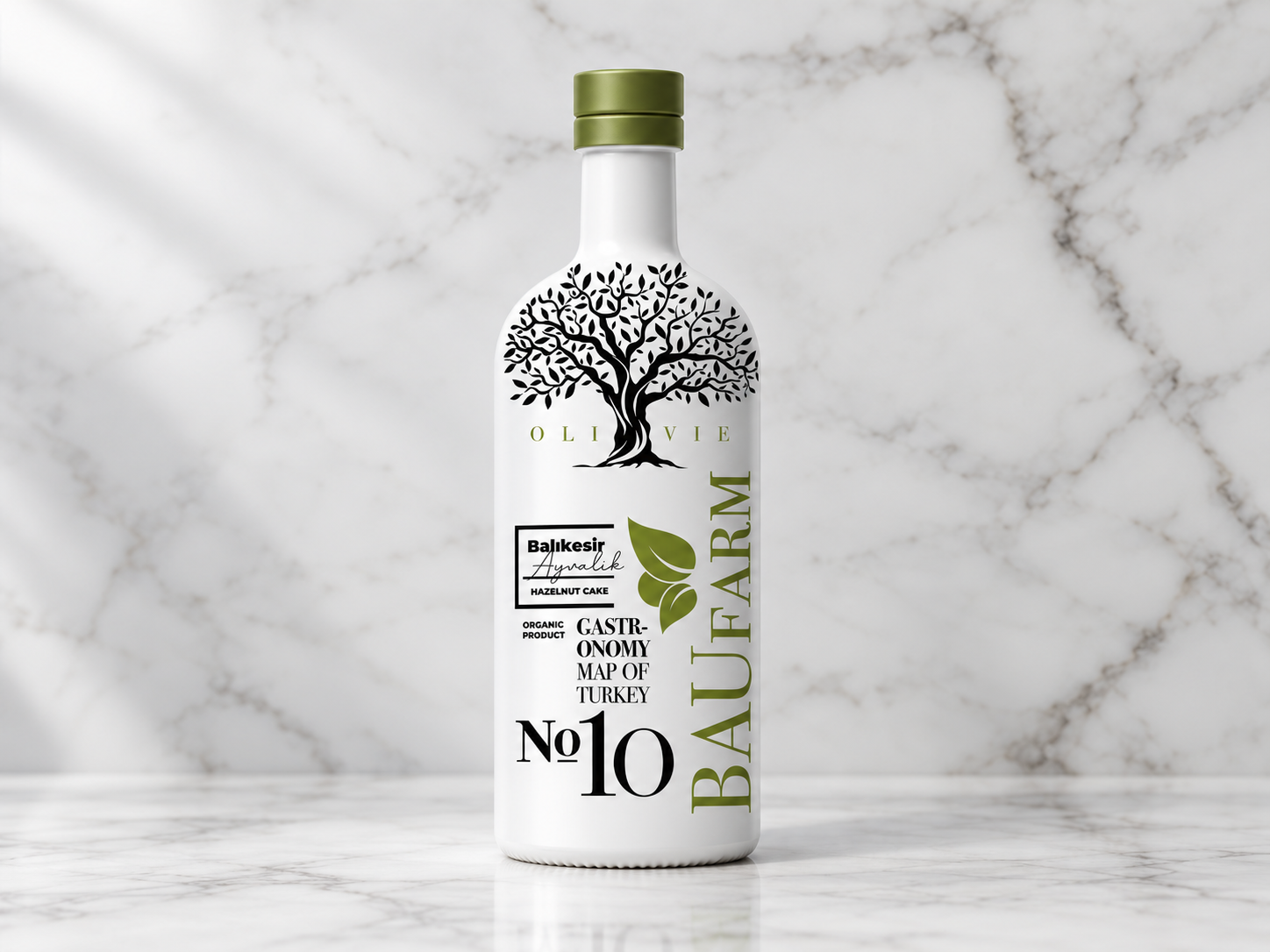
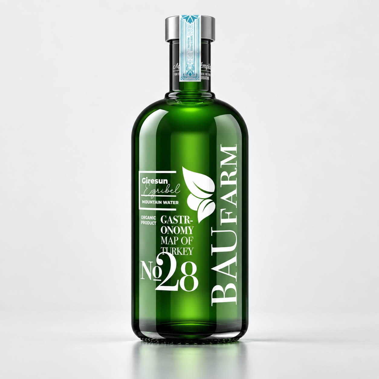
BAUFARM · Bottle label design
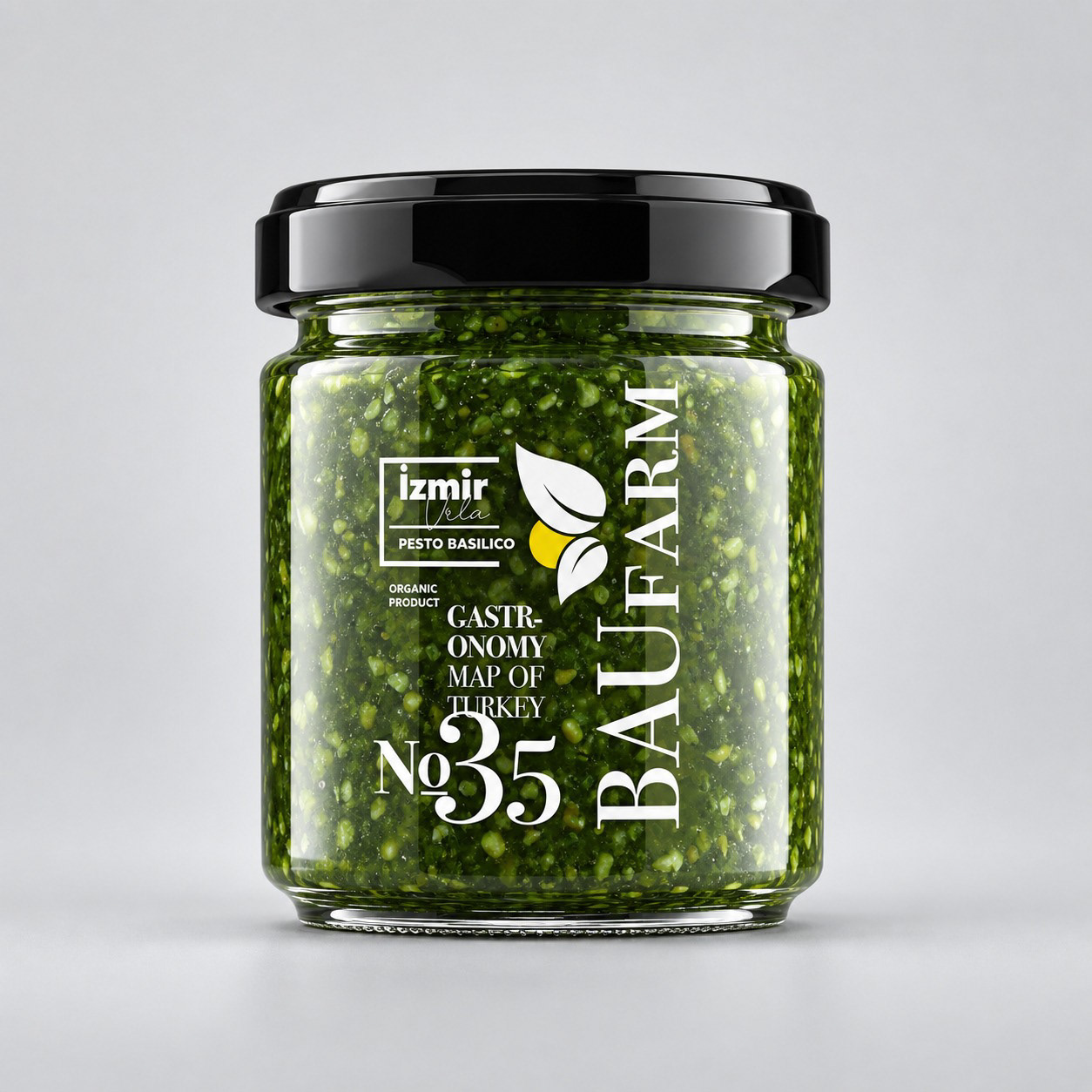
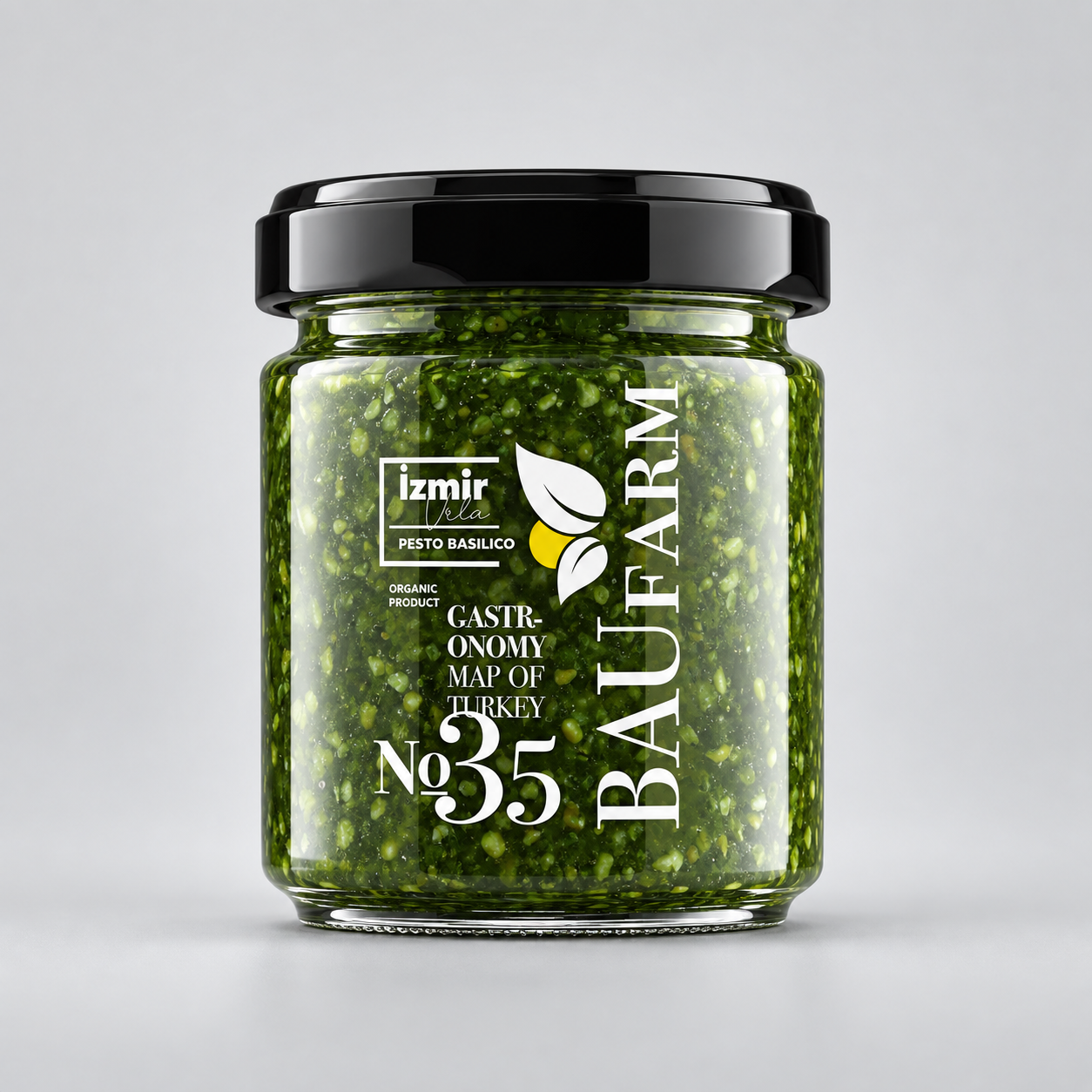
BAUFARM · Pesto packaging
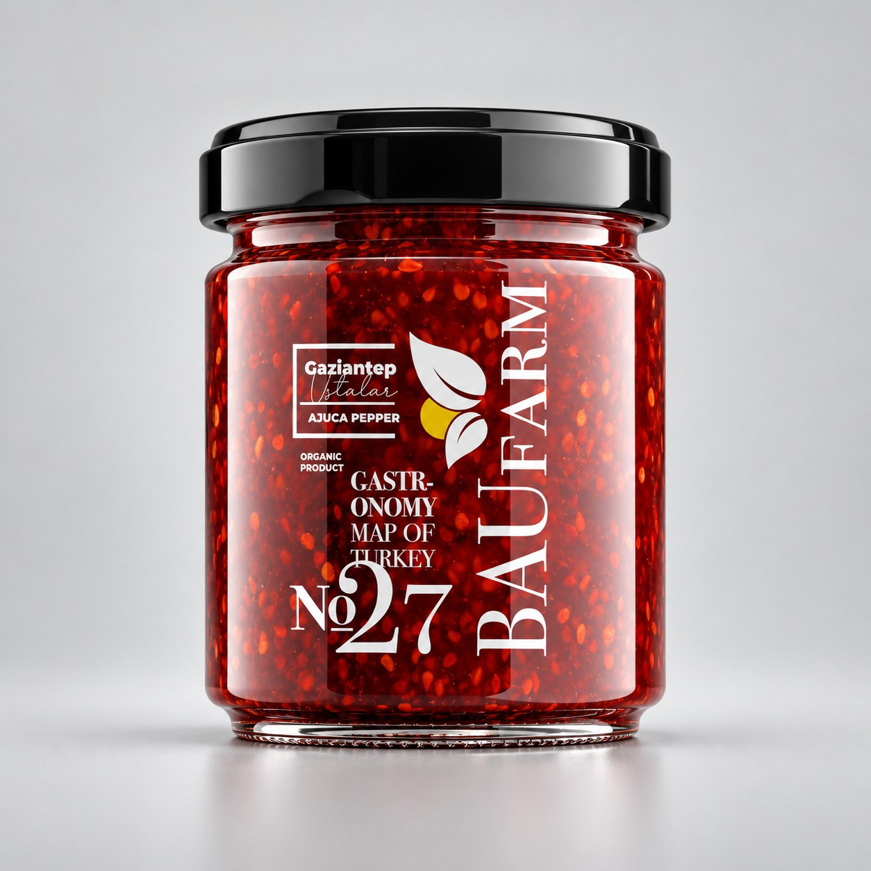
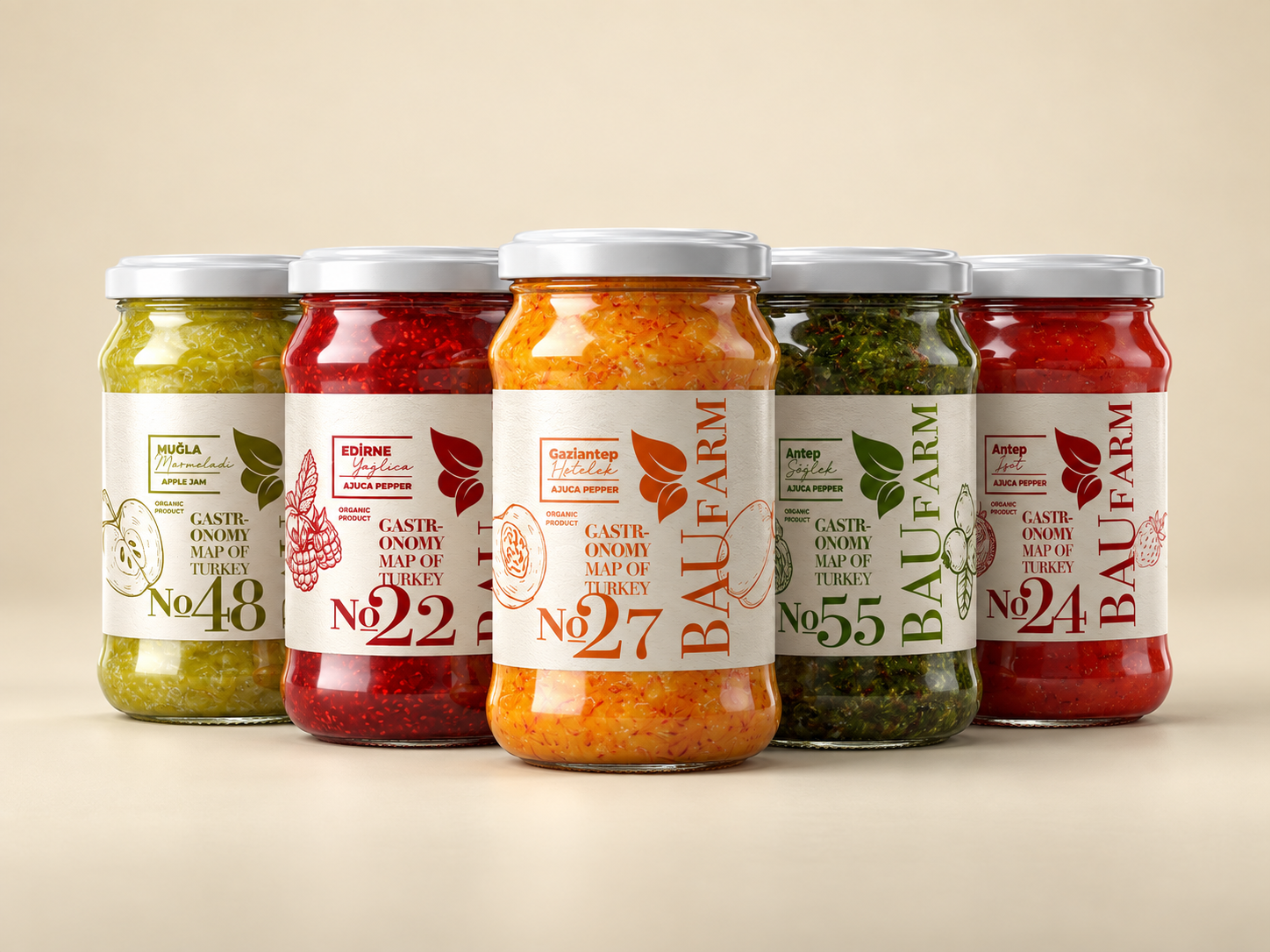
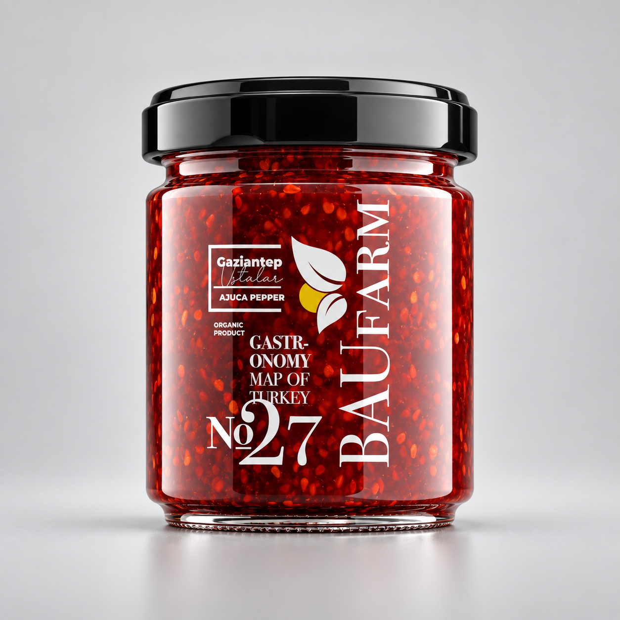
BAUFARM · Preserve packaging
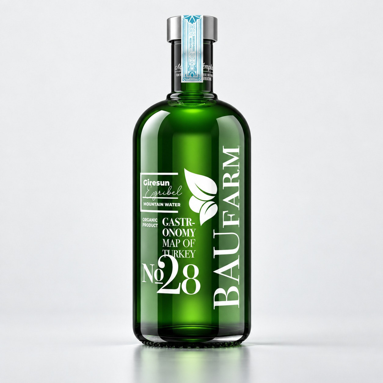
BAUFARM · Green bottle label design
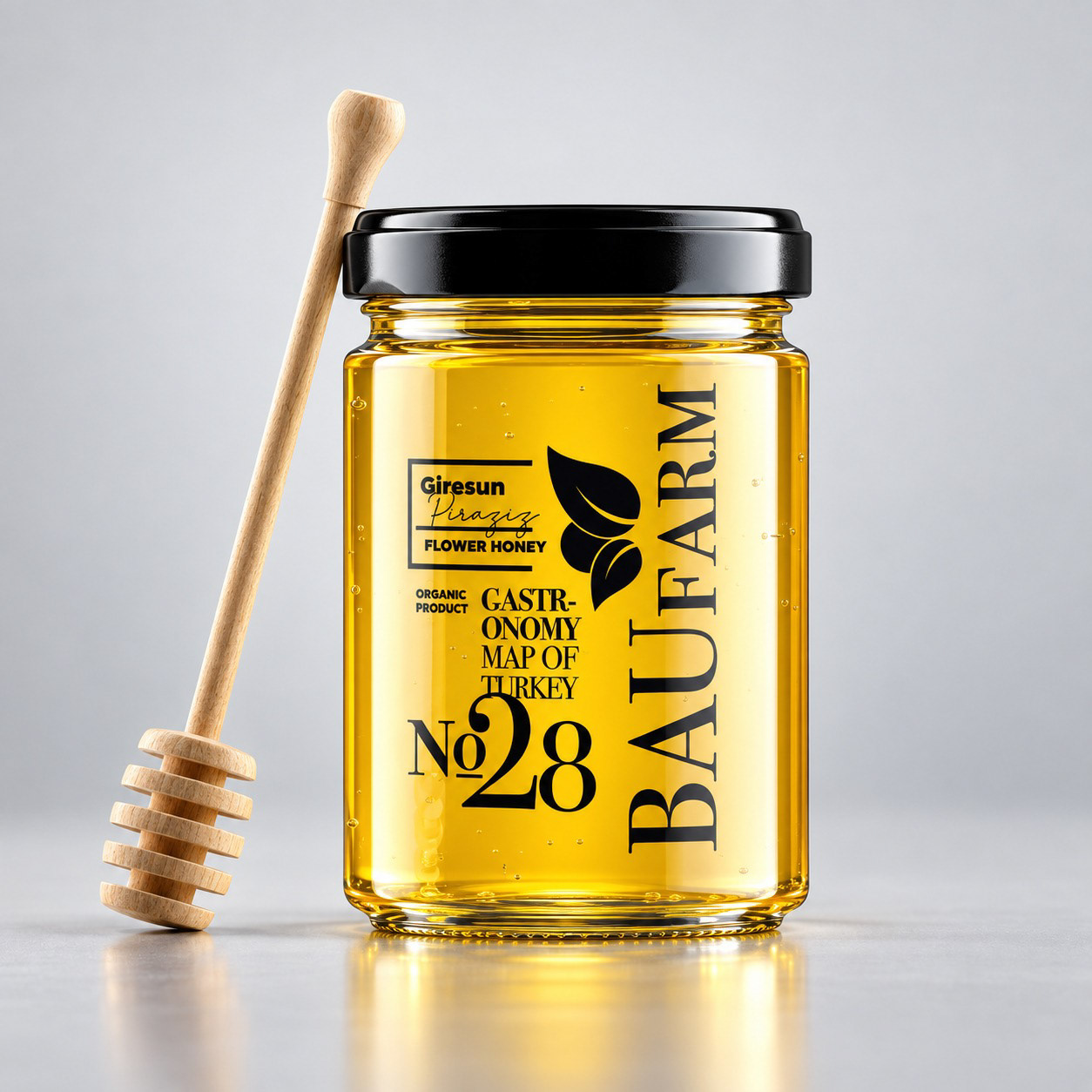
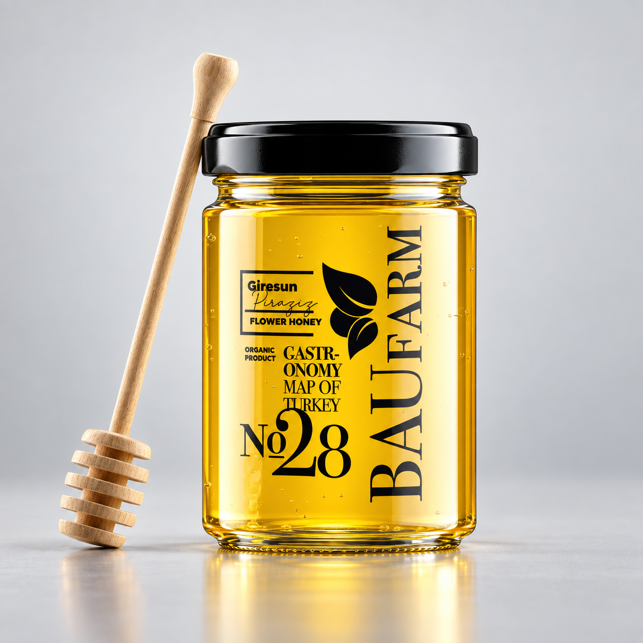
BAUFARM · Honey packaging
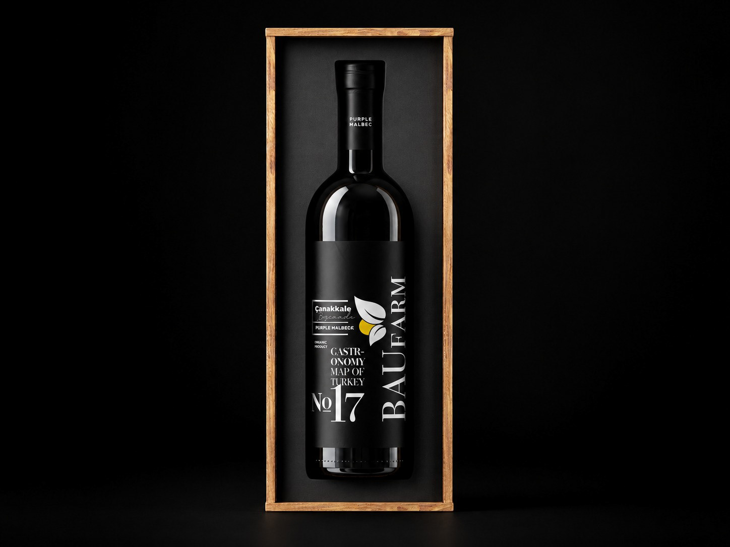
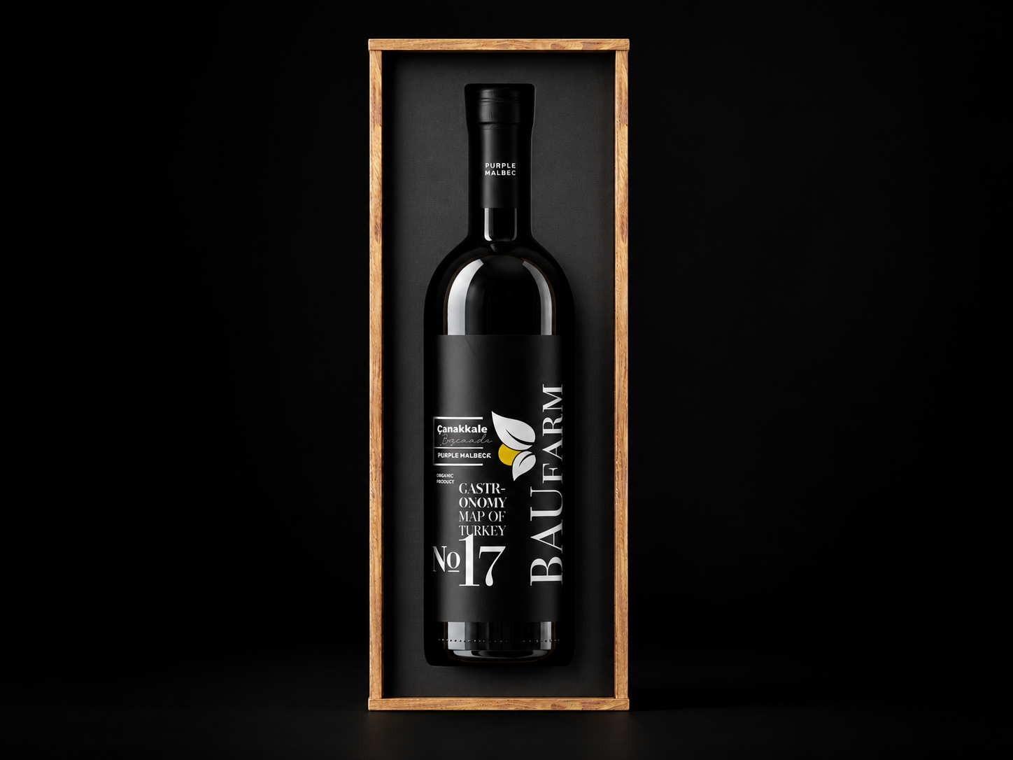
BAUFARM · Wine packaging · No. 17
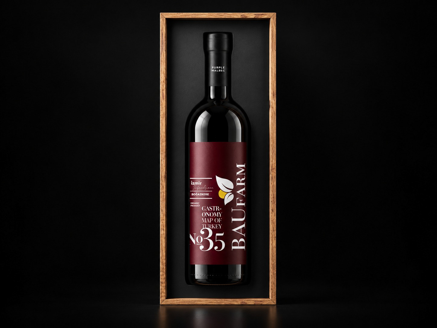
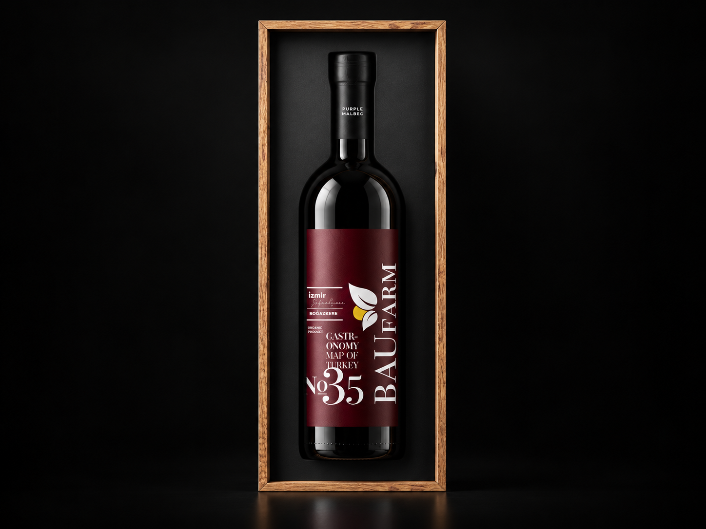
BAUFARM · Wine packaging · No. 35
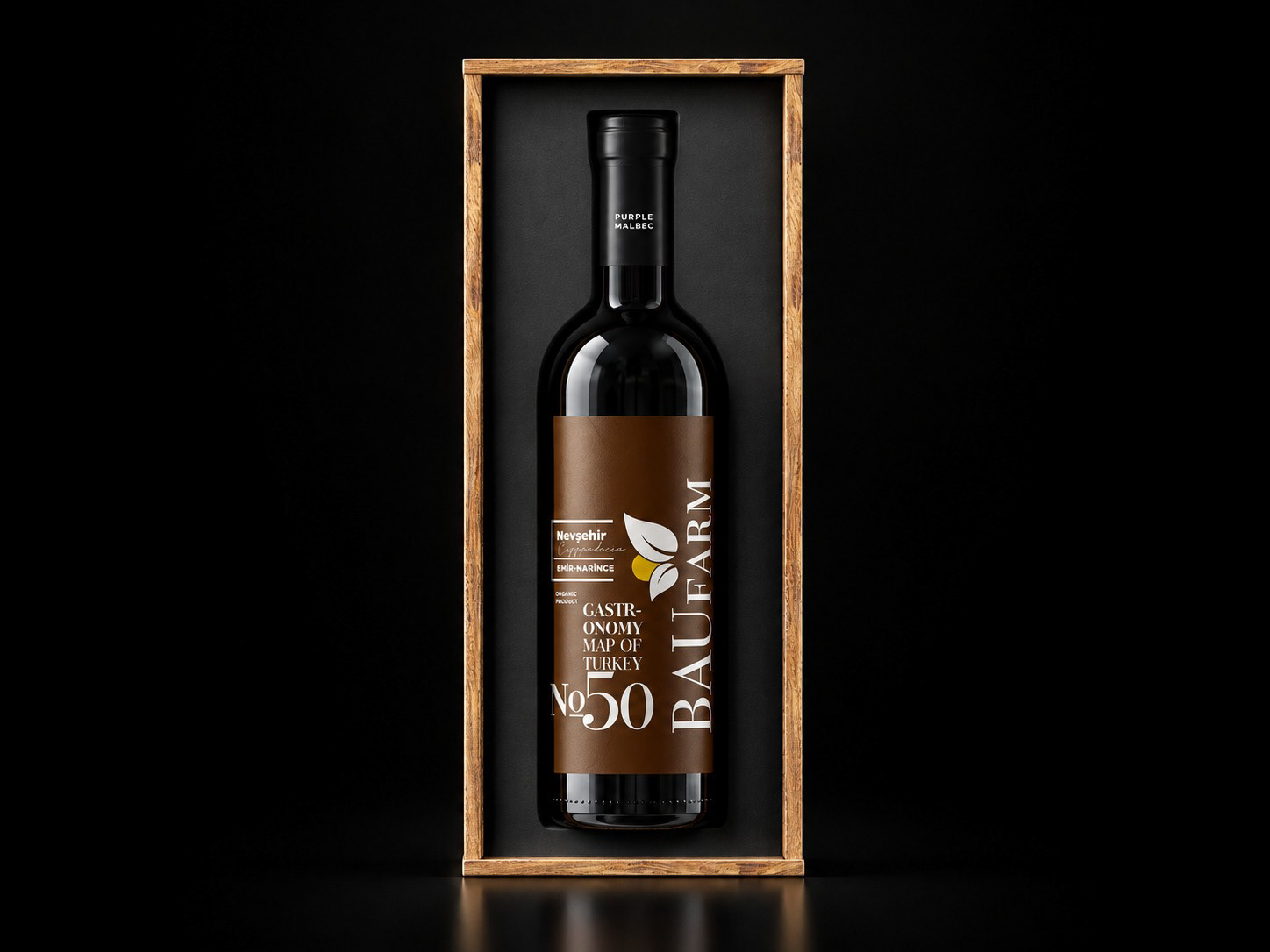
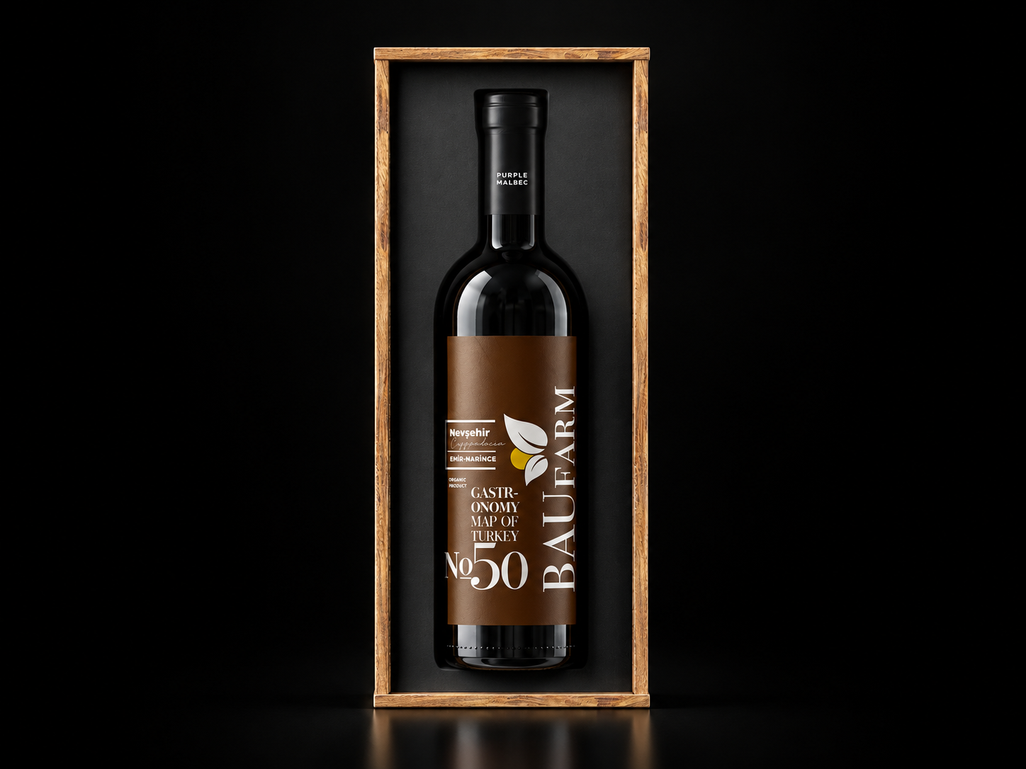
BAUFARM · Wine packaging · No. 50
BAUFARM
Brand Identity & Packaging
A visual identity for a collection of regional food products, bringing different flavours, places and packaging formats into one recognisable family.
The design centres on a simple idea: origin belongs at the heart of the product story. Prominent place names and plate-code-inspired numerals connect each package to its geography, while expressive typography and botanical motifs give the collection a distinctive character.
ONE FAMILY, DISTINCT IDENTITIES
A consistent typographic hierarchy connects jars, bottles and paper packs. Colour distinguishes the products; repeated proportions, the BAUFARM wordmark and botanical details hold the range together.
Each application balances two scales of attention: a recognisable silhouette and bold lettering at a glance, followed by product names and regional details on closer inspection. The identity stays coherent without making every package look the same.
A QUIETER EXPRESSION
For the wine series, the same identity takes on a more restrained expression. Dark bottles, a limited colour palette and slender vertical compositions shift the emphasis towards material, proportion and detail.
Presented together, the applications show how a shared design language can move between everyday food packaging and a more considered gift presentation.